Project Description
Brand Identity Design
The LED Spot
The design for The LED Spot logo started out as a sketch from the owner. He had imagined the word “LED” projecting a downward cone of light that displayed the word “spot” in an oval at the bottom. In the interest of adaptability, we worked together to craft a more horizontal and streamlined concept. I chose to place the word “the” inside the logo and have that serve as the source of the light because the convex right side of the D in LED is reminiscent of the curved lens inside a light projector.
Typefaces: Custom, DIN Condensed Bold
Colors: #000000 | #F5C653 | #FAE7AA

Jabber Jaw Telecom
For this Colorado-based telecommunications company, I wanted to design a simple, yet effective logo. The owner wanted to use shades of blue and the custom shape above the wordmark represents a telephone signal reaching out to connect the community. I chose Futura for the typeface because I like the contrast of the sharp points in the “w” with the curves of the rounded letters, but I created a custom “J” for the beginning of each word to better match the curves on the signal design.
Typefaces: Custom, Futura Book
Colors: #253C75 | #1379B7

Program in a Box
The Program in a Box logo presented an interesting design challenge because it is a logo for a program within the Prostate Condition Education Council’s outreach mission. PCEC already had a brand identity, so I incorporated their colors into this logo design. This logo was designed for a variety of programs that PCEC would distribute to companies nationwide in an effort to promote overall men’s health, so I kept the logo design very simple in the interest of versatility.
Typefaces: Lato Bold, Lato Semibold, Lato Ultralight
Colors: #D61F26 | #004088 | #D7ECF4
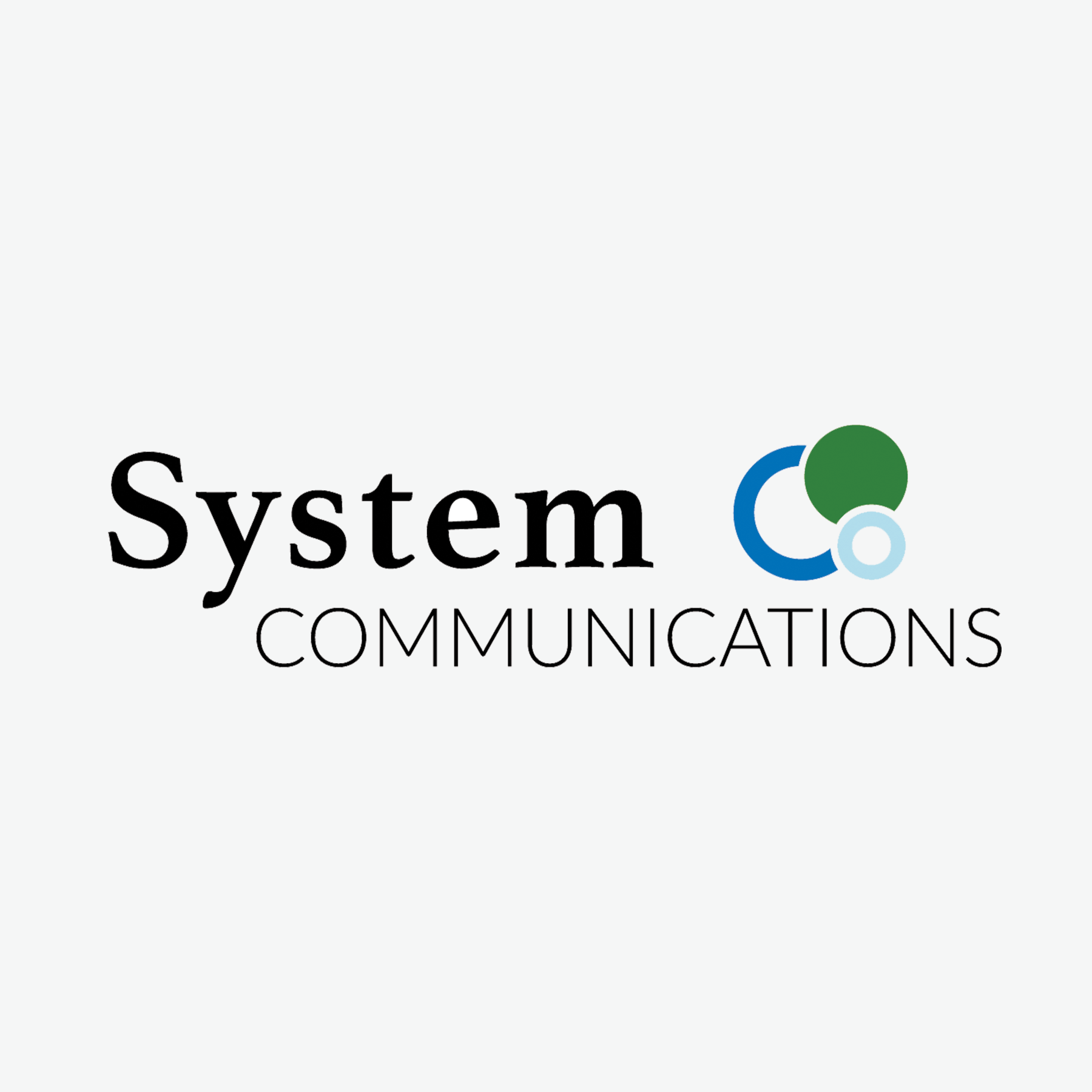
System Communications
System Communications is a telecommunications company based in Colorado. For this logo, I chose interlocking circles, with two outlined circles coupled with a solid one, to represent connectivity and integration. The serif typeface I selected for the word “system” represents the old-school nature of telephone systems themselves, while the sans-serif typeface on the word “communications” represents the modernity and simplicity that this company brings to the telecommuncations industry.
Typefaces: Athletas Bold, Lato Light
Colors: #0071B8 | #B0DDEC | #308014
Hi-G3 Growing Table
The Hi-G3 Growing Table is a proprietary design for a table used for growing indoor medical marijuana. The design under the “I” represent the roots that grow beneath the table, which is shown by the black line under the words “growing table,” while the counterform of an arrow between the roots and the “I” depict upward growth, for both the plants and the industry as a whole. The design is meant to be clearly visible when placed as a sticker on the PVC growing tables themselves.
Typefaces: DIN Condensed Bold, Helvetica Neue
Colors: #000000 | #458C40